Visual standards: also for surgical issues.

Reporting standards are less common in operational processes such as production, but this does not mean that they work any less well there. This article uses the use of Visual Business Analytics (VBA) in the area of OEE analyses to show how easily and comprehensibly standards can be applied in production. The layer concept, structure, uniformity and focus on deviations also work very well in this area, meaning that standards can also offer considerable added value in dynamic and complex environments.
Do we need visual standards?
A Google search for the term "dashboard" leads to many colorful graphics that lack one thing: a uniform logic and design. In contrast to other areas, such as cartography or music, no uniform standard has been established for the graphical presentation of key figures.
However, standards do exist in this area, and the International Business Communication Standards (IBCS) are probably the best known. This standard is most widespread in the financial sector, in controlling or in the comprehensive presentation of key figures, which is also reflected in the examples on the IBCS website.
Another standard or good practice is based on the book Visual Business Analytics [Kohlhammer, Proff, Wiener] from 2018. The book extends these ideas by adapting them to modern, interactive BI tools and shows that the development of standards must also take technological advances into account.
Visual standards offer some obvious advantages:
- Comparability: Standardized design makes it easier to quickly capture and compare information across different reports and dashboards.
- Comprehensibility: Standardized visualizations can help to avoid misunderstandings, as they enable a consistent interpretation of the data presented.
- Efficiency: Standards reduce the time and effort required for the design of individual solutions and at the same time offer a professional quality of presentation.
Why aren't standards everywhere?
Nevertheless, standards cannot be said to be enforced across the board. Even within organizations, it is not a matter of course to follow uniform standards across different processes and areas.
Experience has shown that there are a few reasons for this:
- Variety of tools and applications: Many organizations use different tools that do not have uniform representations.
- Organization-specific needs: Different processes and requirements in different areas of an organization can make it difficult to apply uniform standards. At least that is often the reasoning.
- Individual preferences: Some designers and analysts might argue that strict standards can limit the creative and innovative use of visualizations. This is all the more the case the fewer hard standards there are in an area. This is why, for example, controlling is usually less prone to this kind of creativity than marketing.
When the numerous possibilities of modern BI tools come together with the lack of standards, the creativity of individual users can unfold very freely and information view is understood in such a way that many crowded line charts and stacked columns can be found in representations of different sizes and scales.
Challenges in production reporting
Reporting standards are comparatively rare in operational processes such as production. In some cases, the opinion persists that standards cannot be implemented in operational processes at all, but are only something for finance, controlling and statistics.
However, reporting plays a very important role in production. However, it is inherently divided into two parts: On the one hand, there is operational reporting, which often takes place very close to the machines themselves, and on the other hand, there is overarching reporting, where data is aggregated. Operational reporting often relies on integrated evaluations of the operational systems due to the required timeliness and the integration of specific reporting tools, which is not easy to implement for a long time.
These can look different for each machine and are not designed with the perspective of possible consolidation and integration into an overarching reporting system. In the meantime, modern BI tools such as Microsoft Power BI are increasingly finding their way into operational reporting and are making it possible to move away from "silo thinking" in the area of data. This also enables the implementation of standards, which is shown below after a brief technical introduction to the topic using the example of the OEE key figure.
OEE key figure and its use
The OEE key figure (Overall Equipment Effectiveness) is an indicator in production technology that evaluates the overall performance of production systems.
It is made up of three main components:
- Availability: This component measures the actual running time of a machine compared to the planned running time. High availability means that the system runs largely trouble-free during the planned operating times, which indicates efficient maintenance and rapid rectification of failures.
- Performance level: The performance level compares the quantity actually produced with the quantity achievable under ideal conditions (planned quantity). It shows how well the system is utilized during the operating time. A low performance level can indicate problems such as machine breakdowns, suboptimal settings or slower working speeds.
- Quality rate: This rate is calculated by subtracting the sum of rejects and rework from the total production and relating the result to the total production. A high quality rate close to 100% indicates that most products meet the quality requirements and require little reworking.
As a product of these three key figures, the OEE key figure provides a comprehensive view of the efficiency of systems and production processes. It helps to identify areas with potential for improvement and to narrow down problems, e.g. the accumulation of failures or quality problems on individual machines.
Use of OEE in guided dashboards
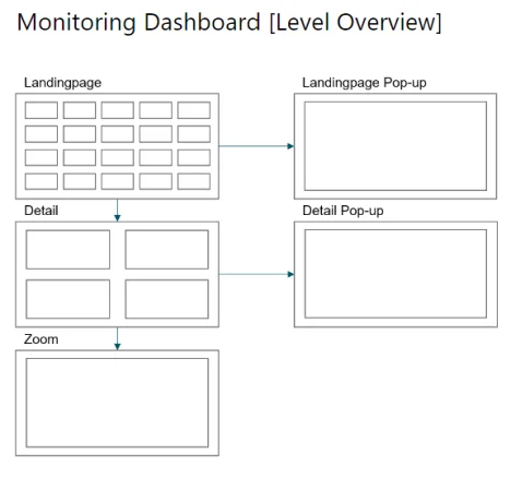
As the OEE is very well suited for comparisons as an aggregated key figure, it is a perfect starting point in a monitoring dashboard to identify systems that are "conspicuous" and then take a closer look at them in detail.
It is therefore well suited for the landing page to enable quick navigation from an overarching level - without the need for lengthy manual searches and filters. The division into tiles is ideal here, as the OEE per system is much more meaningful and balancing across different systems should at least be viewed critically, as these can have different target specifications and are therefore not necessarily comparable.

The actual search for the causes then takes place at the detailed level - and the OEE would be less helpful here than its three components availability, performance wheel and quality rate. Anomalies in these individual key figures quickly indicate the area in which a problem exists and enable a quick response.
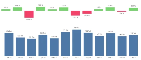
In addition, all three key figures are percentage values and, according to their definition, have a reference value with which they are compared. Deviations, which play a central role in the Visual Business Analytics model, are therefore obvious and can be displayed intuitively.

This approach fits in well with the concept of visual business analytics, where the clear visualization of deviations and trends is crucial to enable quick and well-founded decisions. The integration of OEE into a dashboard therefore not only creates an overview, but also serves as an efficient tool for more in-depth analyses and the proactive management of production facilities.
Use of OEE in analytical dashboards
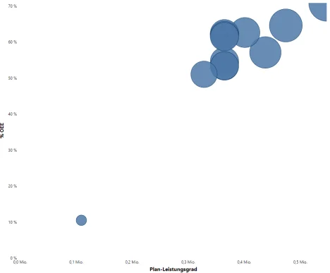
The OEE and its components are also well suited to examining dependencies, e.g. whether the ambitious plan targets in the area of runtime and production quantity lead to more rejects and therefore poorer quality. This is where the analytical dashboards of Visual Business Analytics (VBA) are very useful and can be put to good use.
The structure or portfolio dashboard can be used here to compare different key figures and identify correlations. A useful visualization here is the scatterplot:

The individual circles can represent systems, system types, individual days or shifts - depending on the level at which conspicuous correlations are to be traced.
Artur König and Michael Tenner are Power BI experts at BI or DIE and when they are not working on new dashboards, data models and creative technical solutions, they like to share their knowledge online.
Both will soon be live on the Power BI or DIE live stream, with the topic of the blog being addressed in Michael's session in particular: Blog: BI or DIE
LinkedIn: Artur König · Michael Tenner
 tetys GmbH & Co. KG